Kenya Youth Opportunity Dashboard
Leaflet.js GIS Data Visualisation Policy
Overview
An interactive web dashboard that maps youth unemployment, education access, and internet connectivity across all 47 Kenyan counties — giving policymakers, researchers, and civil society a single spatial lens on youth opportunity gaps in Kenya.
The dashboard ranks counties into two actionable groups: Top 10 counties with highest unemployment (priority for investment) and Bottom 10 counties with lowest unemployment (model cases to learn from).
Live Dashboard: wanjiru-1.github.io/-kenya-youth-dashboard/
The Problem
Kenya's youth unemployment crisis is spatially uneven — yet national policy often treats it as a uniform challenge. County-level data existed in siloed reports and spreadsheets, making it hard for decision-makers to see where the need is greatest or what success looks like.
What I Built
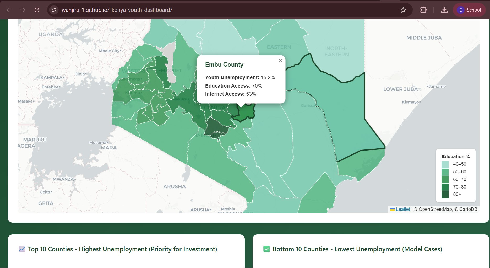
A fully interactive Leaflet.js choropleth map where each county is shaded by education access percentage and clicking a county opens a popup with three indicators:
- Youth Unemployment (e.g. Embu County: 15.2%)
- Education Access (e.g. Embu: 70%)
- Internet Access (e.g. Embu: 53%)
Below the map, ranked tables surface the 10 counties most in need of investment and the 10 performing best — turning a map into an actionable policy brief.
Tools & Methods
| Tool | Purpose |
|---|---|
| Leaflet.js | Interactive choropleth map |
| JavaScript | Dashboard logic and popups |
| GeoJSON | County boundary data |
| National datasets | Youth, education & ICT indicators |
| GitHub Pages | Deployment |
Key Insights
- Education access ranges widely across counties, from under 50% to over 80%
- Internet access is often the binding constraint in counties with good education coverage
- The relationship between education access and youth employment is non-linear — internet infrastructure matters as much
Year
2024 – 2025